


Fuck the Super Game Boy: Fighting games
When I say that the Super Game Boy was great for fighting games, I don’t want you to make the mistake of assuming that I mean these are great games. They’re not. Game Boy fighting games have traditionally suffered from several major problems: confusing visuals after having been ported from arcade games, impossible controls that you need a real joystick to input consistently, and multiplayer being bloody unfeasible.
Unfortunately, not even the magic of the Super Game Boy can make the controls reliable. Hence the mediocrity.
But what it could do was make the multiplayer beautifully simple.
Wait, why was multiplayer ever a problem?
From the very start, the Game Boy was always ostensibly multiplayer capable. It was also always an extraordinary pain in the ass. First, you needed to get a link cable. Then, you needed to convince a sucker friend that, no, really, this game is totally worth spending $40! on, since multiplayer requires the second player to also have a cartridge. Then you needed to keep within two feet of your friend while you struggle to get the connection working. In practice, that last part wasn’t a problem, because you’d never actually get past the part where you both need to own copies of the game.1
So that’s kind of a pain in the ass.
But with certain Super Game Boy games, you could do multiplayer with a single cartridge, like any other SNES game did– just plug in an extra controller. This obviously wouldn’t work for games like Pokémon,2 but it’s perfect for Bomberman or fighting games.
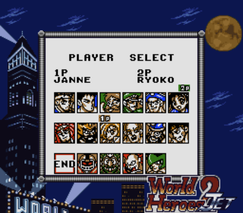
Let’s talk about World Heroes 2 Jet
The arcade game it’s based off is basically completely unremarkable in every way. Most of the colourization techniques should seem fairly obvious. For instance, the character select screen is far from monochromatic; there’s pretty clearly a lot of colour on there, making every character on it stand out. But let’s see what that breaks down to in terms of palettes:

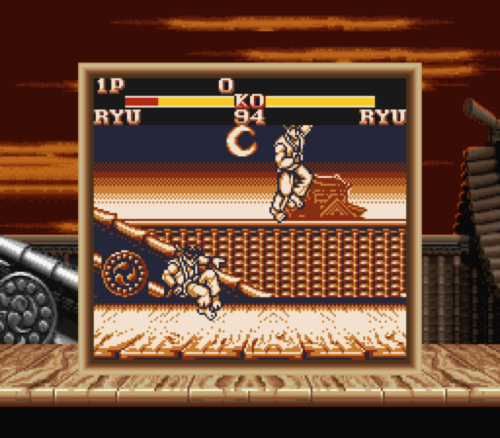
I think that pretty much speaks for itself. Every character portrait uses one of those four, and the only variation is the single accent colour. It starts by giving you vibrant colours on the character select screen, which makes a strong impression; to contrast, however, the game itself looks like this:

You can see how this screen breaks down. At the top, the lifebars are a single colourization region. At the bottom of the screen, there are three regions: one for the names/win indicators, and one for each portrait, which use the same palette as on the character select screen. And most noticeably, there’s the main part of the screen, which features a monochrome palette.
Each stage features a different palette for the main screen, but all of them are deliberately cooler, less vibrant palettes than what’s used for the character portraits.

Why is it so important that the portraits are vibrant?
The problem with having a completely monochrome screen is a fairly obvious one: you, wrongly, get the impression that all the characters are supposed to look like they have uniform colours. Or at least, you would, if not for the giant colourful portraits at the bottom, which serve as a constant reminder of what the characters actually look like.

As a result, the stage palette instead is used like dramatic lighting. You’d never confuse it for representing what the characters ordinarily are, thanks to those portraits. Instead, it’s very clearly just setting the stage’s atmosphere.
But wouldn’t it be even better with MORE colours?
For comparison, here’s the above stage, as it looks like on a Game Boy Pocket, and as it looks in the original arcade version, respectively.


The Super Game Boy version is a lot more atmospherically evocative. In black and white, the cave doesn’t make much of an impression on you at all. It’s just a dark cave. In the arcade version, it’s a dark cave, with a giant shiny pile of treasure in the middle that draws your eye away from everywhere else.
On a Super Game Boy, it’s more than just icy: it’s cold and dreary. The original rendition draws your attention towards a giant background detail, but the SGB rendition draws your attention towards a feeling. As a result, it’s a lot more visually compelling.
Okay, that’s all great, but wouldn’t mirror matches be really frigging confusing?
It’s obviously really difficult to distinguish two characters in a completely monochrome game apart. Here’s a screenshot from the absolutely atrocious Game Boy port of Street Fighter 2 that illustrates the problem, traditionally:
They’re identical! It turns out, the game is an unplayable piece of shit anyway; not being able to tell who’s who is actually the least of your concerns.
World Heroes 2 Jet gets around this problem in a really interesting way. Every character does, in fact, have an alternate colour scheme.

Holy shit! How does that work?
Here’s the trick: each character sprite only actually uses three out of the four colours. It’s actually one of the least ambiguous mirror matches I’ve ever seen; with the chaos and flashy colours and overwhelming colours common in arcade fighters, only having totally different character palette can– usually only for a second– leave you confused. It’s not a major problem or anything, but it’s non-existent in this case. There’s absolutely no way to forget who’s who: you’re either the light one in the foreground, or the dark one.
So that’s pretty neat.
Isn’t that just that game doesn’t have flashy specials? That shit’d never work for something as crazy as a KoF game!
King of Fighters ‘963 for the Game Boy has no right to be even worth talking about.

I mean, what the hell, right? King of Fighters is all about quick-paced 3v3 combat, features incredibly difficult movesets (the easy supers ask for two half circles in a row), flashy specials, and a giant cast.
You’ll never be able to pull off a super consistently without flinging yourself into the sky, and the cast is tiny, and the pace is all wrong, but it does deliver on the 3v3 combat,4 and more importantly, unlike the last game, doesn’t have monochrome graphics in fights.
Wait, how the fuck can an action game have non-monochromatic fights? What kind of technical witchcraft is this?
KoF '96 doesn’t do anything of any real technical innovation with its colourization. Its fight screens have four screen regions: the health bars, the main area, the top half of the super bars, and the bottom half (more on this in a bit). It’s just instead of monochrome palettes, its palettes all feature black, white, and two different hues.
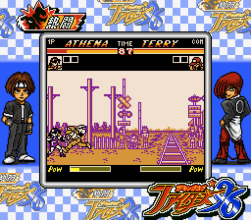
I can’t for the life of me figure out what this colour relationship actually is. They’re not quite complementary, although they’re certainly a few steps removed from it. I asked my art student friend, but all he said was “There’s a word for that relationship too but no one knows it but color theory teachers.”
It’s really effective, though.
The characters are immediately set apart by their seperate colours, which is a really helpful trick in general, especially as a visual shorthand when the fireballs start flying.

For optimal distinction between the characters, they should have made the palettes use actual complementary colours: blue/orange, pink/green, yellow/purple. The point is, that because they exist as opposites on the colour wheel,5 complementary colours appear jump out when you put them next to each other. But it’s obvious why they didn’t do that. The two colours have to look very distinct when a single colour is applied to an otherwise mostly white sprite, but at the same time, go together when used in the background.
It’s a remarkably clever use of colour, and you don’t really see palettes like this in video games ever, for any reason, because anything else can just colourize sprites seperately, and would never have to try.

It’s great for mirror matches, too, although as you can see, it doesn’t quite work for characters that are mostly white.
Isn’t that like, an insane amount of work for a Super Game Boy release of a shitty port of an arcade game?
It seems completely inexplicable why these two games look so good. They don’t really play well or anything. They’re pretty exceptional as far as Game Boy fighters go– ask anyone who had the misfortune of owning a Game Boy Street Fighter or Mortal Kombat– but that’s not exactly saying something. I can only assume that, realizing that the only reason why people play fighters is for multiplayer, and nobody having ever made a Game Boy fighting game that you could ever convince a friend to drop $40 on, they had to make it seem worthwhile using other means.
While with even most of the best SGB games, the Super Game Boy mode is was put in as an afterthought, you can actually tell that KoF '96 was designed around it.
In arcade KoF games (in certain modes), when the the meter at the bottom reaches full, the bar starts to flash, drains rapidly, and changes colours. Given the way Super Game Boy colourization works, the problem with that seems obvious: in order to make it work like the Pokémon life bar, you’d have to simplify the hell out the design. But what they actually did is a lot more clever.

This wasn’t just thrown in as an afterthought. This was figured out while the UI was still being designed; which is still fairly late in development, but not that late.
So what, are you saying it looks perfect?
I don’t want to give the impression that there aren’t problems. This, for example, is something that happens a lot. Like, all the friggin’ time, in fact. Both games do it: it’s not terribly uncommon for stuff to fly into the life bar area and get miscolourized.6

Still, unbelievably, these things that should just be unnoteworthy mediocre ports are games that actually use colour in an incredibly clever way. I’d even hazard to say that they use it better than basically any arcade fighter ever did. I’m not recommending these as high quality games, but as lessons in colour design in video games, they’re frankly rather amazing. When I talk about taking advantage of colour restrictions for effect, I’m talking about things like this. You can do a lot with four colours.
Next up: the flagship of the Super Game Boy, Donkey Kong '94.
Pokémon, obviously, changed all this, by virtue of everyone on the face of the Earth owning a copy. Later, with the Game Boy Advance, the link cable could be used to download executable code, meaning one-cartridge multiplayer was possible with a number of games. ↩︎
Unless you owned the Japanese exclusive Super Game Boy 2, which had an expansion port on the side. ↩︎
It actually was released in English– only in Europe– as “King of Fighters: Heat of Battle,” but I can’t actually find it, so instead I’m working with the Japanese version. Given that it’s a fighting game, there is not exactly a lot that’s lost without translation. ↩︎
In 2000, the PSX port of Marvel vs Capcom couldn’t do 2v2 tag battles because of memory constraints. In 1997, the Game Boy port of King of Fighters '97 had standard 3v3 fights. This is basically comparing apples to oranges. Hilariously pathetic apples to oranges. ↩︎
The colour wheel should be familiar to anyone who took a high school art class, but it turns out, complementary relationships aren’t really as simple as I’m presenting them to be. It depends on what wheel you use. ↩︎
Embarassingly, even SF2 actually gets this right and keeps characters beneath the life bars. I’m sure it was entirely by accident. ↩︎


