


Fuck the Super Game Boy: Donkey Kong
It turns out, in the first entry, I actually made a mistake about the way Pokémon draws lifebars. I’ve since edited it accordingly with a more accurate explanation.1
Anyway, let’s talk about both the pinnacle and nadir of the Super Game Boy: Donkey Kong.

What the hell’s going on in this image?!
Donkey Kong Land was released in 1995 as a direct follow up to Donkey Kong Country. It’s basically a complete fucking travesty. I’m including it here because it is hands down the ugliest game with Super Game Boy functionality, and it shows exactly how easy it is for Game Boy art to go completely, and utterly wrong.
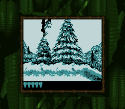
The problem should be fairly obvious: all the details run completely together. There’s no careful balance of light colours and colours, no borders, and as a result the foreground characters frequently blend into the background. It’s honestly not even that much better in motion. You’d certainly never be able to figure out what any of the sprites are supposed to represent if you’ve never played Donkey Kong Country.
Even when it’s colourizing static screens, it looks awful. It turns out, you can’t just take pre-existing art resources, slap colours on them, and expect them to look like anything but absolute rubbish:

The worst thing is that while the art is clearly not hand-crafted for the Game Boy, this title screen was actually modified with the Super Game Boy in mind. There’s some small things that give it away: the giant shadows around the brown parts of DK are to accomodate the palette changing from the brown one to the blue one.
Alright, so what’s the Super Game Boy’s pinnacle?
The reason why I’m showing you how things can go completely wrong is because I’d now like to show you a game where everything went absolutely right: Donkey Kong ‘94.

DK'94 was the very first2 game released with Super Game Boy functionality, and because it was used specifically to promote it, a lot of work went into making it look impressive on it. A lot.
It got a sequel exactly a decade later in the form of Mario vs Donkey Kong for the Game Boy Advance. It’s also one of the greatest action/puzzle games ever, so if you haven’t played it, stop right now, and go do so. It’s amazing, and I’m going to give away some of the surprises. No, seriously: go.
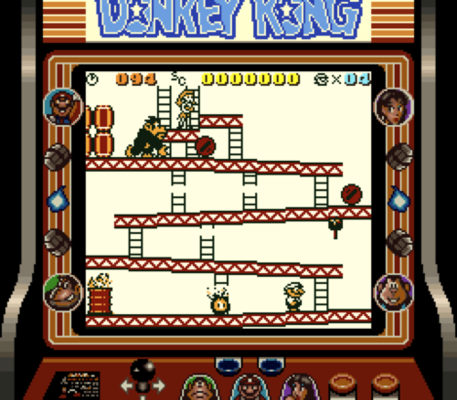
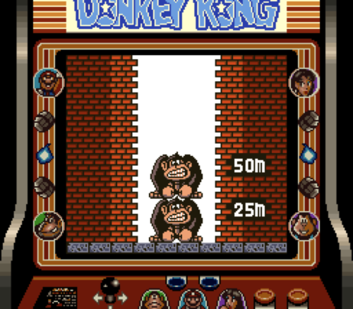
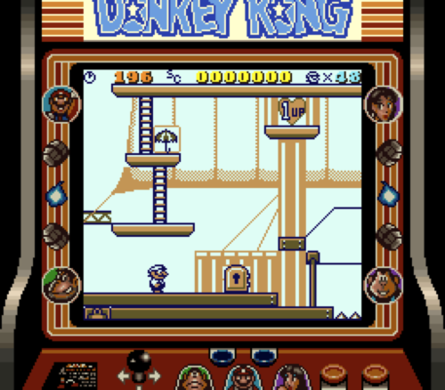
The game starts off by tricking you into thinking it’s actually just another version of the arcade game. The first four levels are right from the original, and are just as sparse for detail as they were originally, including the empty backgrounds. Between levels, it shows the arcade’s equally familiar stacked Donkey Kongs:
When you finish the fourth level, like normal, you end up happily with Pauline… then Donkey Kong gets back up, grabs her and runs off, and then the game begins in earnest, changing to puzzle-based gameplay. After a short cutscene, you’re shown the new inter-level screen: a world map. It does a pretty great job at showing just how different the rest of the game’s going to be.
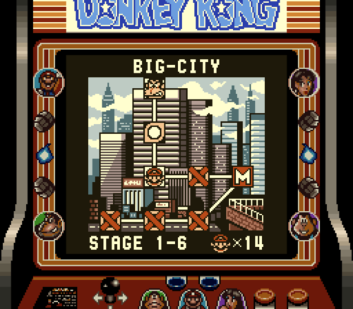
That’s pretty colourful, but why does that matter?
Honestly, this transition wouldn’t work half as well in black and white. The sudden use of colourful detail like this is shocking after having experienced the earlier pretty standard minimalism. Before, the colours were segregated into their own sections, but here, it’s used to sell the busyness of the city; the blue, gray, and red are all mixed together. We’ll get to how this was done technically in a minute, but it’s not just the world map that’s newly detailed.

The levels also have backgrounds now; as you can see, background elements are separated from the foreground by never using black in the background. Darker elements are always in the front.

There’s one more thing about the in-level palettes, though: only one hue ever actually significantly changes. Here’s what those palettes look like.

But why would you always keep one colour the same? Isn’t that limiting?
The main colour of the level is that third one. The other three colours are adjusted slightly to go with it; in the purple city levels, for instance, you can see that the black is actually a dark blue. That’s neat, of course, but what’s more significant about this is that the second colour is always that sort of light salmon-y red.

What this means is that while each of the levels has its own unique colour scheme, Mario never changes. Unlike in the monochrome examples, where the character’s colour is based off whatever world they’re in, Mario always looks the same; it’s the level that changes around him. DK'94 does a great job at never making it particularly obvious that the game is restricted to four colours.

What’s the deal with all these static screens?
Donkey Kong '94 has a lot of static screens. Every four levels, there’s a cutscene introducing a new mechanic. Every time you finish a level, you go back to the world map. And if you collect all three items in a level, you get one of a couple possible bonus screens for extra 1ups. You only have 200 seconds to clear a level, and playing blindly, most only actually take about a minute. If you die, you get booted back to the world map.
That is to say, you only usually spend about a minute on a level, which has a restricted palette, before being given a static screen. As a result, these common, colourful static screens make a very strong impression on the player. This was probably a deliberate move on the part of Nintendo to oversell just how colourful Super Game Boy games could be, and it does work.

Here’s another colourful world map, and it mixes it up even moreso.
But… look at the lake! And the cliff! How can you colour that with rectangular regions? Could it also colourize per-pixel?!
What makes this impressive (and what made me realize my earlier mistake) is that the colourization regions aren’t, in fact, per-pixel. The Super Game Boy just isn’t capable of having that kind of precision. This one confused the hell out of me; I had to dig into the Nintendo Game Boy programming guide to figure out what’s going on in this screen.
As it turns out, the answer is simple. The smallest area that the Super Game Boy can apply a palette to is 8x8. Here’s what that world map looks like, with an 8 pixel grid applied:

So you can see for yourself how that works. Normally it doesn’t look like it’s using rectangular regions, but the cliffs never actually touch the edge of the forest. It impressively uses shadows to mask that, even adding a single stray brown pixel in the upper row to complete the illusion.

And the lake is even simpler: it shares a colour with the green palette. By doing this, they also ensure that the sky and the lake look lighter than the grass when it’s in black and white mode, too.
This sort of colourization wasn’t ever common in Super Game Boy games. It’s pretty much only Donkey Kong '94 that went that far.
The goal of DK'94 was probably to set the bar for Super Game Boy colourization high, but as I’ve shown, it requires a lot of deliberate design work in order to make happen. The Donkey Kong Land approach, meanwhile, is a lot more typical; it’s probably the best example of what you get when you don’t have the art resources be specifically designed for colourization.
Next up: other various action-platformers, and putting an SNES game on a Game Boy cart.
Specifically, I said that the lifebar changes colours, and that it only colourizes a 2 pixel tall area. The latter is impossible– the Super Game Boy can only colourize in 8 pixel increments, which is actually somewhat important. What Pokémon actually does is change the lifebar’s palette. There’s a noticeable delay when it does this. ↩︎
Some sources claim that the first was actually the European predecessor to the Game & Watch Gallery series, the Game Boy Gallery. This is patently false; DK'94 came out in 1994, but the Game Boy Gallery wasn’t released until early 1995. ↩︎


